
Like many companies know, good R&D (research and development) is vital to overall success. In my design process, I like looking at other logos for comparison and inspiration. In the softball world I'm noticing that there's a lot of Brush Scripts and seemingly "Clip-Art" designs. Due to most Softball organizations being non-profit, budgets may not include allocations for proper branding as the majority of funds need (and should) go to the players and teams.
Now - my first part of R&D is to scour the other local softball leagues to see what I'm up against:
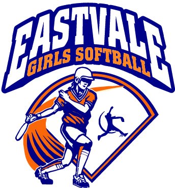


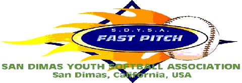

In hindsight, the RC ACE logo isn't so bad compared to some of these. Anyway, from what I can tell in usage are: 4 crossed bats, 7 ball inclusions, 3 logos with script, 1 diamond and one field. Additionally, Eastvale, Chino and Upland use a near identical pitcher silhouette. With this, I have some ideas to base the new league logo on.. tomorrow, I look at inspirations and (hopefully) Friday I'll post my mock-up.


0 comments:
Post a Comment