Wednesday, March 13, 2013

All Good Things...

Thanks for the memories! 2012 - 2013
I started to get serious about designing almost a year ago. I feel like I've seriously grown as a designer: putting out really quality items which will hold up over many years.

Over this past year one of my major re-brands was for a musician (that will be the subject of a later blog), however in one of the cutting room floor designs, I saw something which really struck my eye. Luckily for me, he discarded the logo without a second thought.

The logo I designed for this musician just called to me; more so than the existent "FD-Green" icon which used to be my trademark. This one had all the elements I had been looking for, but never knew it: classic-look, streamlined, retro elements, simple and still maintains that "hot-rod" cool I grew up with. So, without further adieu, I present the new logo for Fuentes Design:


In the update, we still have ties to the old logo (roundel and cursive script), but this one (minus the rounded square) just seems...classier than the other one. I love the fact that this works in all colors and when the scheme is inverted, it really stands out against photo backgrounds (like my new header image).

Crisp, clean and elegant... I think I needed this change.

Monday, January 28, 2013

Fantasy Warfare III

Making little tweaks to the concept. I replaced the script with a new font as the script just seemed out of place with the overall concept. Also - figured it out and added in a new interlocking "SF" logo. I'm really proud of how it came out as I think the "SF" is one of the stronger items I've done.

SF Bees Version 2.0
I'm also debuting what may be the proposed 'Road' and 'Home' uniforms:

Bees' Home (L) and Road (R) uniforms
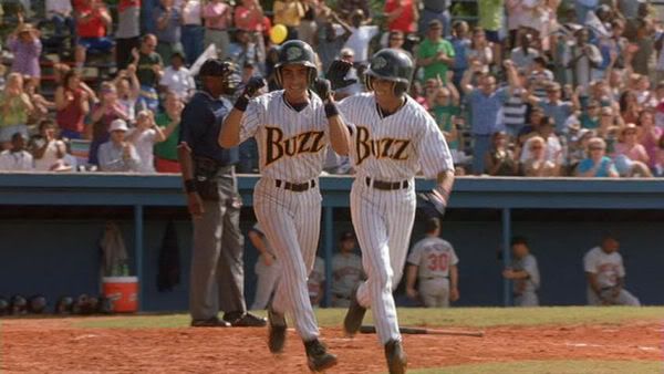
I tried to keep this as simple as the logos; nothing flashy, but a solid baseball look. Typically, the city name would be on the road grays, however "San Francisco" just didn't look right to me. The interlocking SF is pulling double duty (and is reminiscent of the Giants' 1983 - 1993 road uniforms). My ony issue is how I can't seem to find a home for the honeycomb/hive logo. The initial home plate icon was just a throw-away, but it really adds to the uniform (and makes a great BP hat!). My only issue now is to see how this looks with pinstripes, but not wanting to make it look like Major League III's Buzz:


Monday, January 7, 2013

Fantasy Warfare II

From sketches to designs.. We now have a first look at what I'm putting together:

You can see a lot of the design elements from my sketches incorporated into the first set of logos. The main Bee logo had been modified from it's butterfly wings and is now incorporated into the homeplate/stinger design.

The main crest evolved from circle to hexagon to go give a honeycomb effect. The modified bee now rests atop the city moniker while the simple ball is added to the bottom for balance. The secondary roundel is an abstract thinking of the bases, with the hive representing home.

Still thinking of a cap logo as I'm trying to work with an interlocking "SF" and not make it look like the Giants or 49ers. Uniforms are also in the works, but for now I think I have something solid going.